How I Created Two Different Interview Looks in One Living Room
Apr 08, 2026How I Created Two Different Interview Looks in One Living Room
Five interviews, one room, and a travel-sized lighting package. Here is how I used framing, daylight, contrast, and a strategic reset to create two distinct looks that still belonged to the same project.
Most people imagine that a cinematic interview begins with finding the perfect location.
Most of my work begins with walking into an office, conference room, or someone’s home and asking a more practical question: What can this room give me?
On this job, I needed to film five interviews in a single living room. I had only the equipment I could travel with, no traditional location scout, and a schedule that did not allow me to create a completely new setup for every person.
My goal was to create two looks. I could film three people in the first direction and two in the second, reverse their eyelines, and give the editor enough visual variety to cut between speakers without making everyone appear to be sitting in the exact same place.
The result came from making decisions in the right order: find the frames, study the natural light, establish the exposure, and only then decide where the fixtures were actually needed.
Begin with the number of looks the schedule can support
Before moving equipment, I decide what is realistic.
Five completely different setups would have given every interview a unique background, but the reset time would have consumed too much of the day. One setup would have been efficient, but every speaker would have had the same composition and eyeline.
Two setups were the right compromise.
That decision influenced everything that followed. I needed two camera positions that used different parts of the room, two backgrounds that felt visually separate, and two eyelines that faced opposite directions. At the same time, the lighting softness, contrast, color, and skin exposure needed to remain consistent enough that the interviews still felt like part of one project.
Look for depth before looking for lights
When I first enter a location, I start searching for angles that create layers.
Shooting straight toward a flat wall often makes a room feel smaller and less dimensional. Shooting toward a corner gives the frame multiple planes that can be separated through focus, brightness, color, and production design.
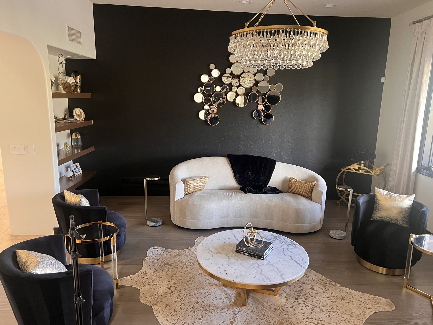
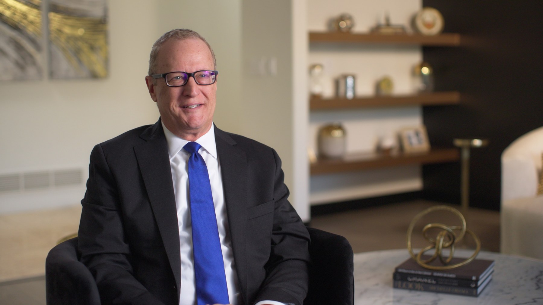
In the first composition, the subject was framed against the lighter wall and shelving. The black feature wall entered the right side of the image and created a natural darker layer. The shelves, artwork, furniture, and practical objects gave the background texture without becoming distracting.
I put the camera up early because the frame tells me what must be lit. With a travel package, I do not have enough output to illuminate the entire room. I need to know exactly what the camera sees so I can spend the available light only where it improves the image.
Treat the window as a lighting decision
The large window was the most influential source in the room.
Before relying on it, I checked the direction of the sun and considered where it would be several hours later. A window that looks soft during setup can become a completely different source when direct sunlight reaches it midway through the interviews.
On this day, the sun would remain above the house rather than shining directly through the glass, and the cloud cover helped keep the ambient level relatively stable. That allowed me to use the daylight instead of closing it off.
The window also determined the subject’s eyeline. I wanted the darker side of the face toward the camera, so the subject needed to turn toward the window. That placed the natural key side away from the lens and gave the face dimension.
Lock the creative camera settings first
I think of camera settings as creative choices before I think of them as technical settings.
The aperture determines how much of the environment remains recognizable and how forgiving the focus will be. Although the lens could open to T1.3, an interview subject may lean forward or move during an answer. Working closer to T2 or T2.8 gave me shallow depth while protecting focus.
I kept the shutter at 1/60 for the 23.98 frame-rate recording and used the camera’s ND filters to place the room at the exposure I wanted.
ND is especially useful because it changes the overall level without changing the contrast relationship already present in the room. If the daylight rises, I can add ND and bring the entire image down together. The difference between the bright and dark areas stays consistent.
Once the frame and background exposure were established, I stopped changing the camera. From that point forward, the fixtures were used to place the subject and selected background elements into that exposure.
Setup one: enhance the natural key
For the first setup, the window provided the natural direction, but I still needed control.
I used a 4-by-6 diffusion frame to create a large, soft source that covered more than the subject’s face. A broad source can illuminate the full key side of the body and tends to feel more natural than a small softbox placed close to the face.
The tradeoff is spill. Unlike a softbox, an open diffusion frame does not contain the light. I added black fabric beside the source to keep stray light from reaching the hallway and lifting areas of the background that I wanted to remain dark.
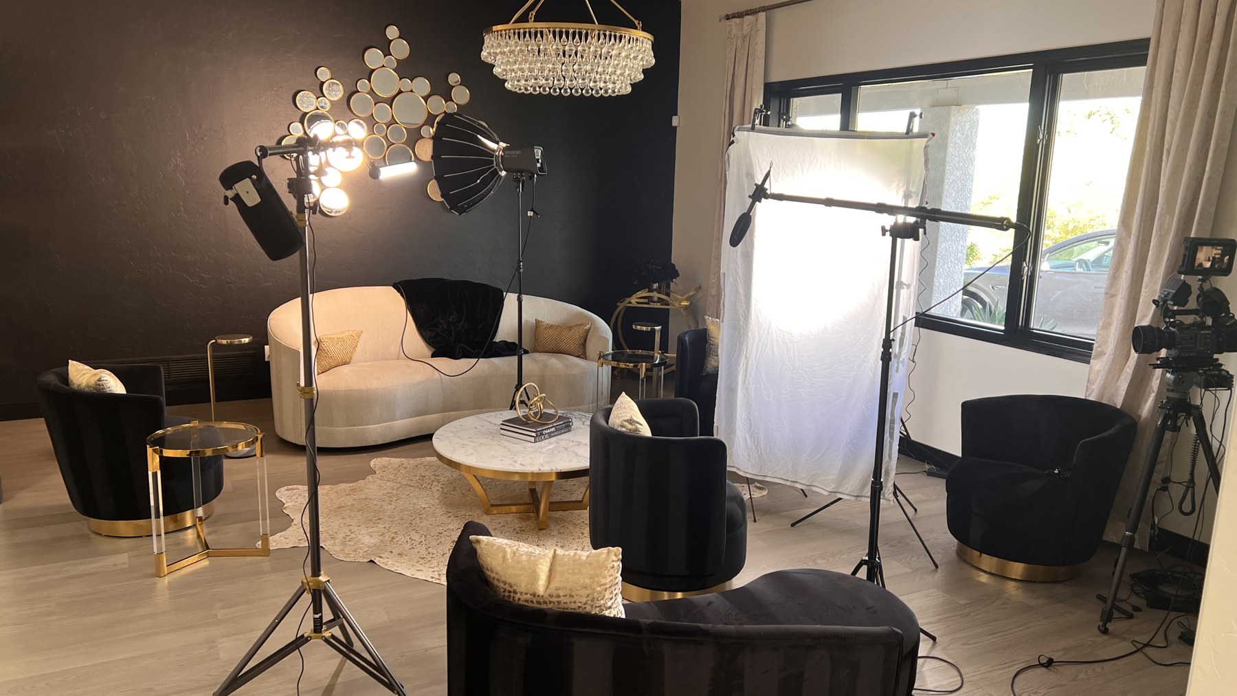
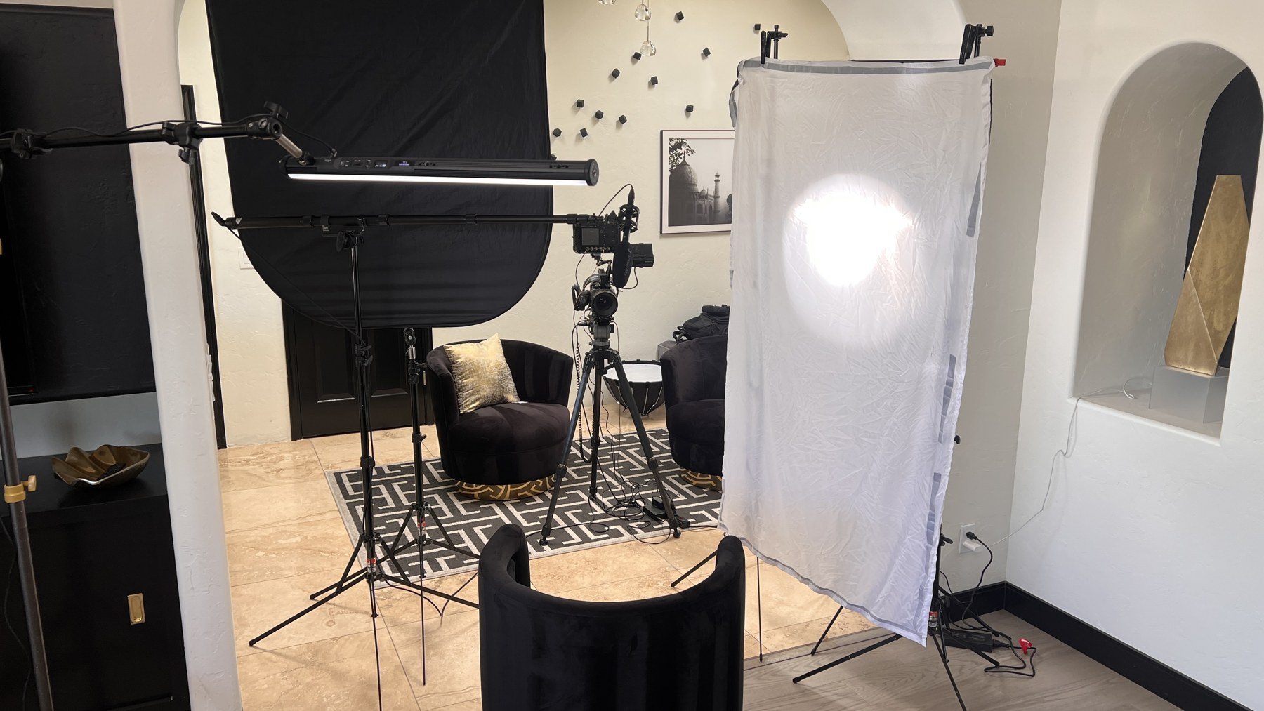
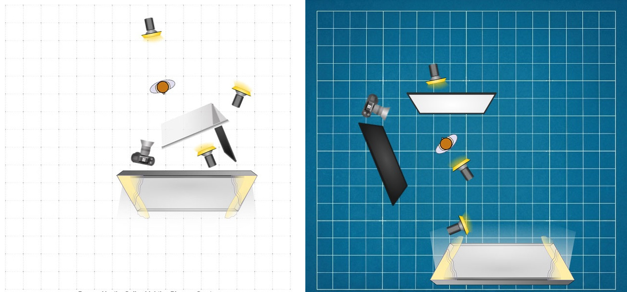
I matched the key fixture to the daylight at approximately 5600K. A small tube light added a subtle edge on the hair and shoulder. It did not need to announce itself; it only needed to create a slight separation between the subject and the background.
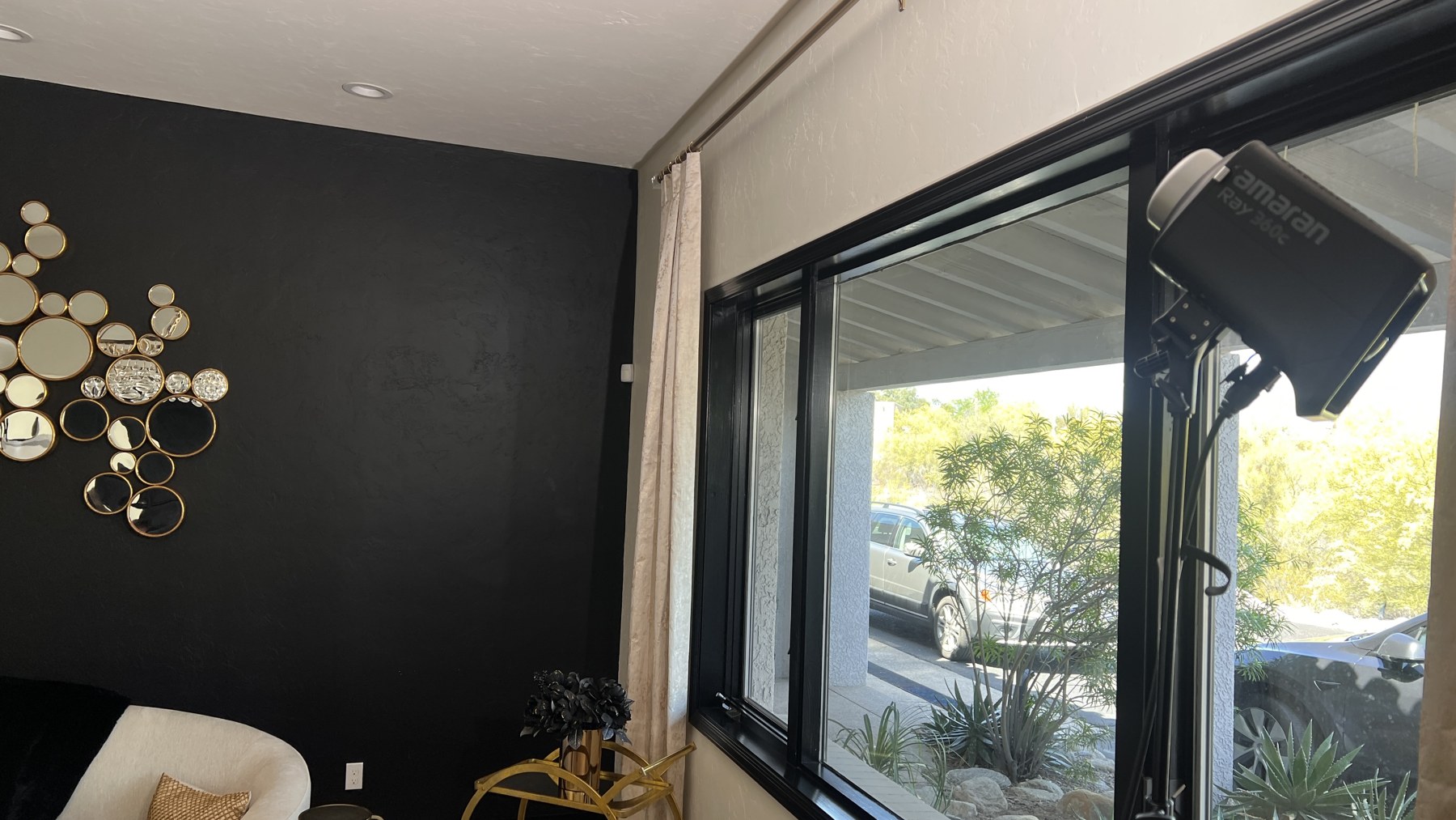
The far corner and shelving needed a little more presence. The dark wall absorbed much more output than expected, so I swapped the roles of two fixtures. The stronger light became the key, while the amaran 360c was moved to the background and warmed to approximately 3800K.
That warmer accent prevented the background from feeling like one continuous neutral value. It created another layer while remaining believable within the room’s existing gold and warm decorative elements.
Setup two: create a different frame without rebuilding the job
The second look began by moving the camera toward the opposite corner and reversing the subject’s eyeline.
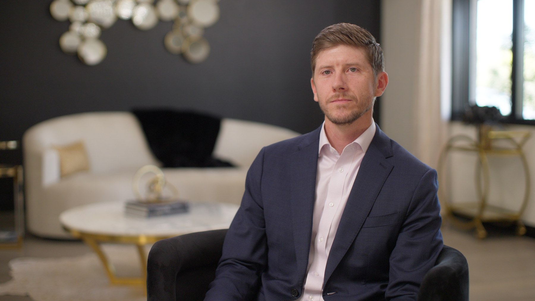
The black wall initially worried me because it could easily become a flat, empty background. What made the composition work was the contrast between the black wall, white couch, gold details, window, and foreground furniture. Those shapes created depth even though the wall itself absorbed a great deal of light.
The window now appeared directly in the frame. I had two choices: lower the exposure until the exterior held detail and then add enough interior light to match it, or allow the window to become bright and embrace it.
I did not have the output to compete with the exterior, and there was nothing visually important outside that needed to be preserved. I chose the second option. A small amount of greenery remained visible, which was enough to communicate that there was an exterior without turning the window into the subject of the image.
Use the ceiling and architecture when space disappears
The original plan was to push a fixture through diffusion for the second key. Once the subject was seated, I realized the source was too close to the diffusion and the entire assembly was too close to the person. The effective source was smaller than I wanted, and the light did not have the quality I was looking for.
There was no room to move it farther away because the camera and key were already positioned in the archway.
Instead of forcing the original plan, I removed the diffusion, turned the fixture around, and bounced it into the nearby archway. The light-colored architecture became the source. Because the bounce surface was large and close to the subject, it produced a soft key without requiring more floor space.
The amaran 360c was aimed into the ceiling at full output to raise the room’s ambient level. Since the brightest part of the ceiling was outside the composition, the result appeared as a natural gradient across the dark wall rather than an obvious pool of artificial light.
Control the light you did not plan for
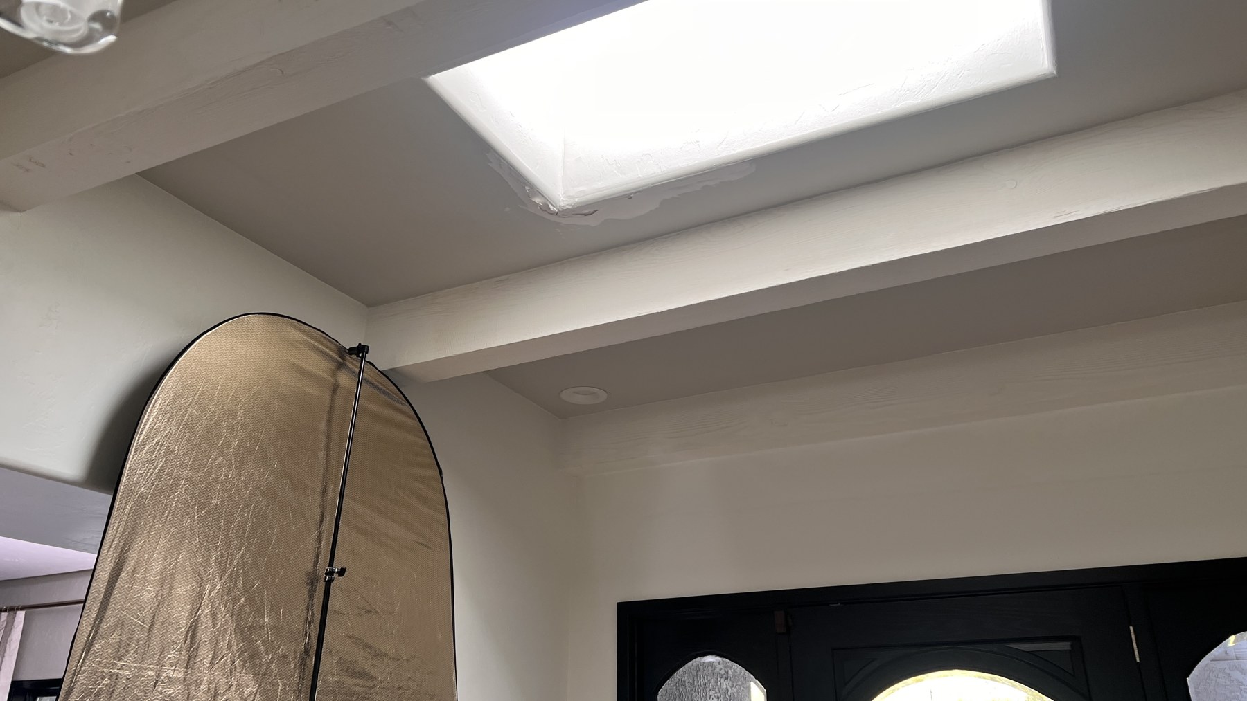
The second setup also revealed a source that was easy to overlook: a skylight in the entryway.
That skylight was adding too much level to the fill side of the face and reducing the contrast I had built. I positioned a popup negative-fill panel beneath it with the black side facing the subject. The gold side faced away so any reflected warmth was sent toward the crew rather than back into the frame.
This is an important part of working on location. The light that ruins the ratio is not always inside the shot. It may come from a hallway, doorway, white wall, skylight, or another room. Once the key is placed, I look beyond the frame and identify anything that is filling the shadows without permission.
Use daylight as a three-quarter backlight
In the second composition, the window created a natural three-quarter backlight.
Whenever possible, I like to position the camera so the sun or dominant natural source sits behind and to the side of the subject, but outside the frame. That direction creates a bright edge along the shoulder and hair while leaving room to shape the face from the opposite side.
If the sun itself enters the shot, it may become impossible to balance with a small travel package. When it remains outside the composition, the same source can provide beautiful separation for free.
The tube light added a little more definition at the top of the subject’s head, while the bounce key brought the face to the appropriate level. Together, those sources allowed the subject to separate from both the dark wall and the bright window.
Reverse the eyeline for the edit
The second setup was not only a different background. The subject also looked in the opposite direction.
That simple change matters when several interviews are cut together. If every person faces the same direction with the same head position, the edit can feel repetitive even when the backgrounds change. Alternating look-right and look-left compositions gives the editor another layer of visual rhythm.
For this job, three people could be filmed in the first setup and two in the second. The lighting styles remained connected, but the backgrounds, eyelines, and balance of the frames gave the client meaningful variety.
A repeatable process for multiple interviews in one room
- Decide how many setups the schedule can support. Build a realistic plan before moving equipment.
- Find two frames with different layers. Look for corners, furniture, windows, and architectural details that create depth.
- Plan opposite eyelines. A look-right and look-left pairing gives the editor more flexibility.
- Study the daylight over time. Know whether the window will remain soft or become direct during later interviews.
- Lock the camera and background exposure. Use aperture, shutter, and ND to establish the visual foundation.
- Light only what the camera sees. Spend a limited travel package on the subject and the background layers that matter.
- Control spill and accidental fill. Flags, black fabric, and negative fill are often as important as the fixtures.
- Let the location become part of the lighting package. Windows, ceilings, and archways can become large motivated sources.
- Adapt when the planned modifier does not fit. The right result matters more than preserving the original diagram.
- Keep the visual rules consistent. Match softness, skin exposure, contrast, and color even when the direction changes.
Final thoughts
Creating multiple interview looks is not about carrying enough equipment to rebuild the room for every person.
It is about recognizing which parts of the location can do more than one job.
The window can be a key in one direction and a backlight in another. A fixture can push through diffusion in one setup and bounce into architecture in the next. A dark wall can absorb light and create difficulty, but it can also give the frame contrast and depth.
When the framing, exposure, and natural light are solved first, a small lighting package becomes much more effective. You are no longer trying to light an entire living room. You are shaping two intentional images inside it.
If you would like to learn more about exposure, camera control, lighting, composition, and creating more intentional images, be sure to check out my online course, Essential Camera Settings.
by Chris Tinard © cNOMADIC 2026
Learn more about cNOMADIC’s cinematography philosophy and training at cNOMADIC.com.