How This Creative Brief Changed My Lighting Approach
Aug 03, 2026How This Creative Brief Changed My Lighting Approach
A familiar studio, a repeat client, and one request: make this year feel different. Here is how the brief led me to use RGB light in a way I normally would not for a corporate interview.
Every lighting setup begins before the first fixture is switched on.
For most corporate interviews, the visual language is clear. The client wants the people on camera to feel professional, credible, and sophisticated. My usual response is to create light that feels motivated and natural: a soft key with a believable direction, controlled contrast, and separation that does not call attention to itself.
This project asked for something different.
I was filming a series of interviews for an annual corporate awards show. We had used the same studio, background, and basic production design in previous years, but the client wanted this year’s interviews to have a new identity while still feeling consistent with the brand and the event.
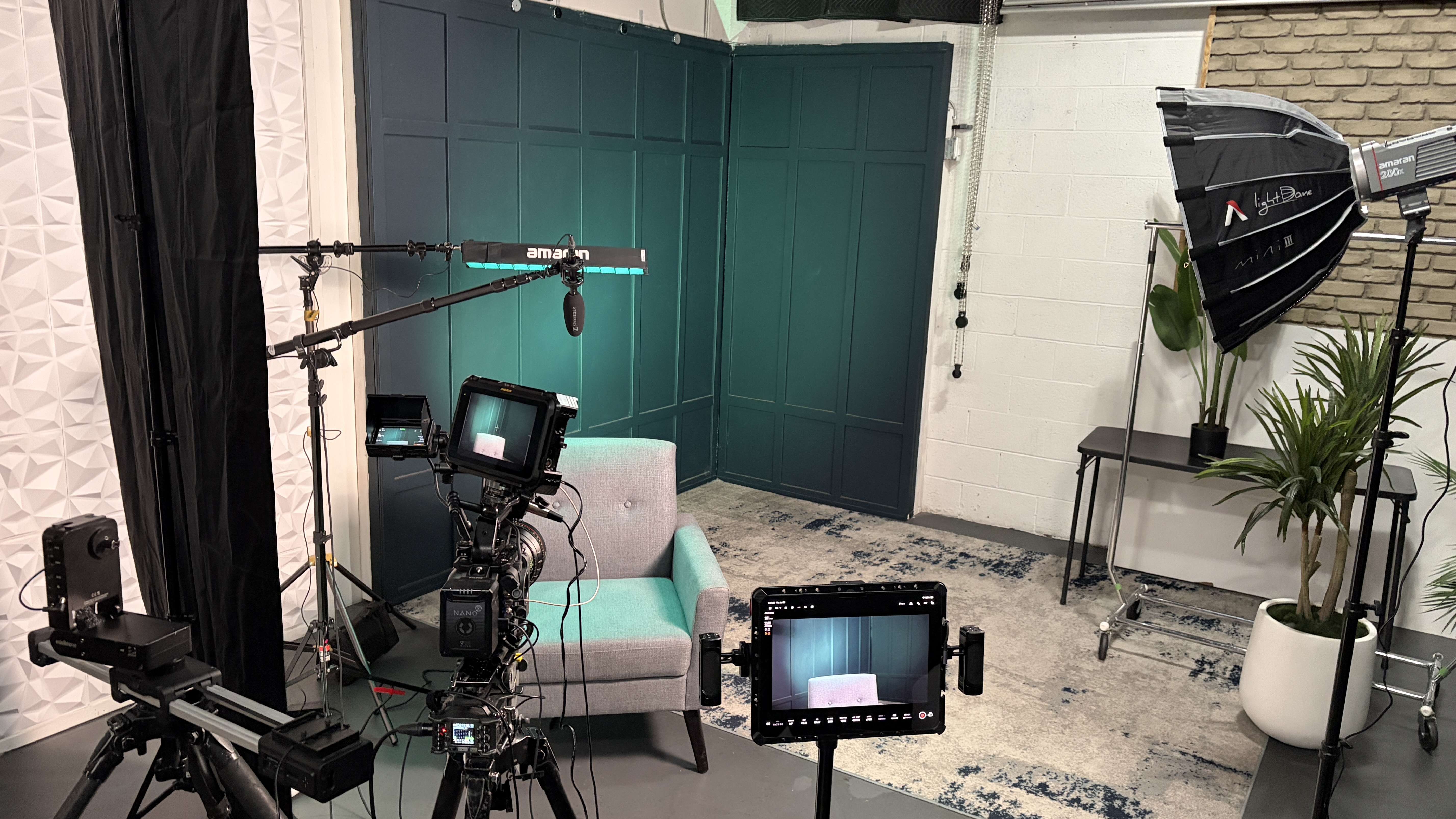
The studio itself was essentially a black box. There was no window or existing practical light to motivate the look. Instead of treating that as a limitation, I used the creative brief as permission to move away from my normal habits.
Let the brief determine the visual rules
A creative brief should do more than tell you what equipment to bring. It should tell you how the audience is supposed to feel.
In this case, the interviews still needed to feel polished and appropriate for a corporate awards show, but they could not look like a repeat of the previous year. That meant the fundamentals still mattered—good skin exposure, intentional contrast, clean composition, and a background with depth—but the color and edge light could be more expressive.
When a location gives me motivated light, I usually follow it. In a black studio, there was no dominant natural source to obey. The brief became the motivation.
Create depth in a background that starts flat
The background was made of dark slatted panels. Without light, those panels disappeared into a nearly uniform black surface. I needed to reveal the texture without simply washing the entire wall.
I used a Neewer HB80C RGB fixture with a reflector to throw a colored circle across the background. I did not have a projection lens, so the edge of the circle was not as precise as it would have been with optics, and the spread was larger than ideal. But the slats and the corner of the room broke up the shape and turned that imperfection into texture.
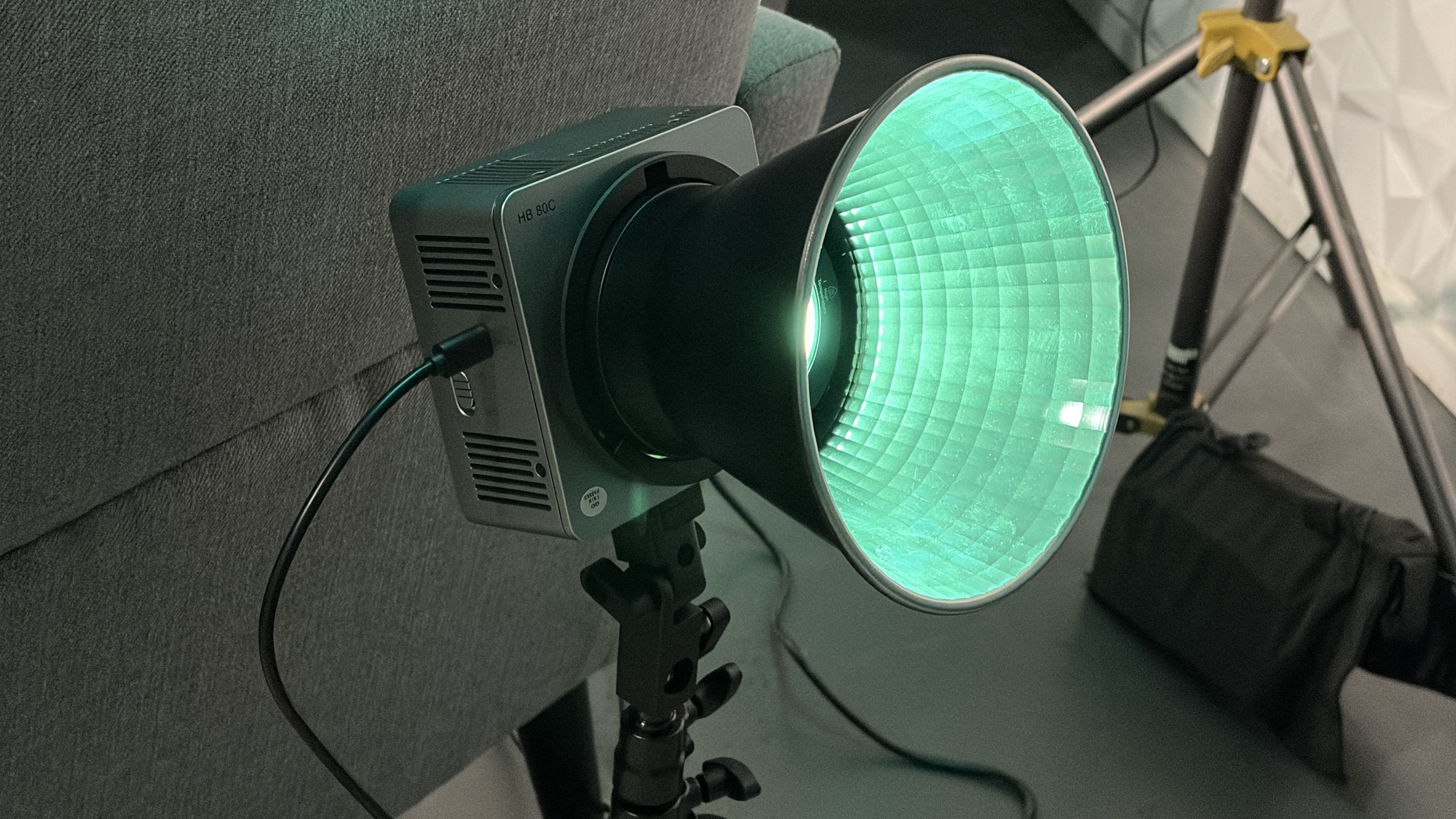
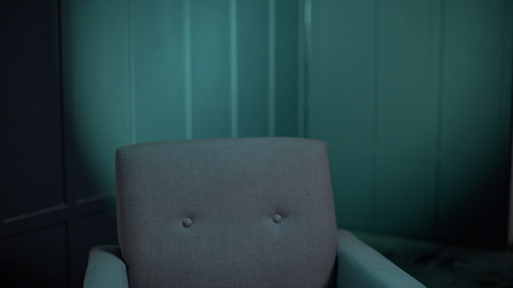
I selected a teal color that worked with an existing blue element in the set. Matching those colors gave the image a cohesive palette instead of making the RGB light feel like an unrelated effect.
The important decision was not simply to add color. It was to decide where the color belonged, what shape it created, and how it supported the identity the client wanted.
Break a habit when the accident improves the idea
I normally keep a backlight close to a believable white-light source. If my key is at 5600K, I may warm the backlight to 5000K, 4800K, or even 4500K. That small color difference creates separation without making the light feel obviously artificial.
For this setup, I had been using an RGB tube for product shots and accidentally left it in RGB mode when I moved it into position as the backlight. Once I saw the color on the subject, I decided not to correct it.
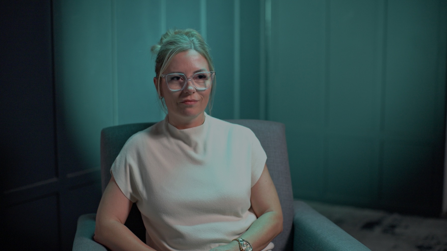
I matched the tube to the color on the background and positioned it farther forward than I normally would—almost overhead and pointing down. That created a harder colored edge across the hair, glasses, face, shoulders, and the front of the shirt.
Technically, it broke several of my usual rules. Creatively, it gave the interviews the difference the brief required.
Build the conventional lighting underneath the creative choice
The RGB treatment could be bold because the rest of the setup was controlled.
My key was an amaran 200x pushed through a softbox. I placed it on the subject’s key side and used a light meter to set the exposure roughly one to one-and-a-half stops above middle gray.
On the opposite side, I used a portable 8-by-4-foot V-flat. The same tool could become white fill or black negative fill depending on the subject and the contrast I wanted. Moving the white side closer lifted the shadows; moving it away or turning the black side toward the subject deepened them.
I judged the final fill ratio on the monitor, but the meter gave me a repeatable starting point. That mattered because several different people would be photographed in the same setup.
Use false color to protect the layers
Colored light can make exposure more difficult to judge by eye. A frame may look dramatic while the skin, shirt, or background is sitting at a level that will be difficult to grade consistently.
I used both the light meter and false color to separate the technical exposure decisions from the visual excitement of the RGB palette. The subject needed a dependable skin level, while the background could fall away into darker values and the colored edge could sit brighter where it created separation.
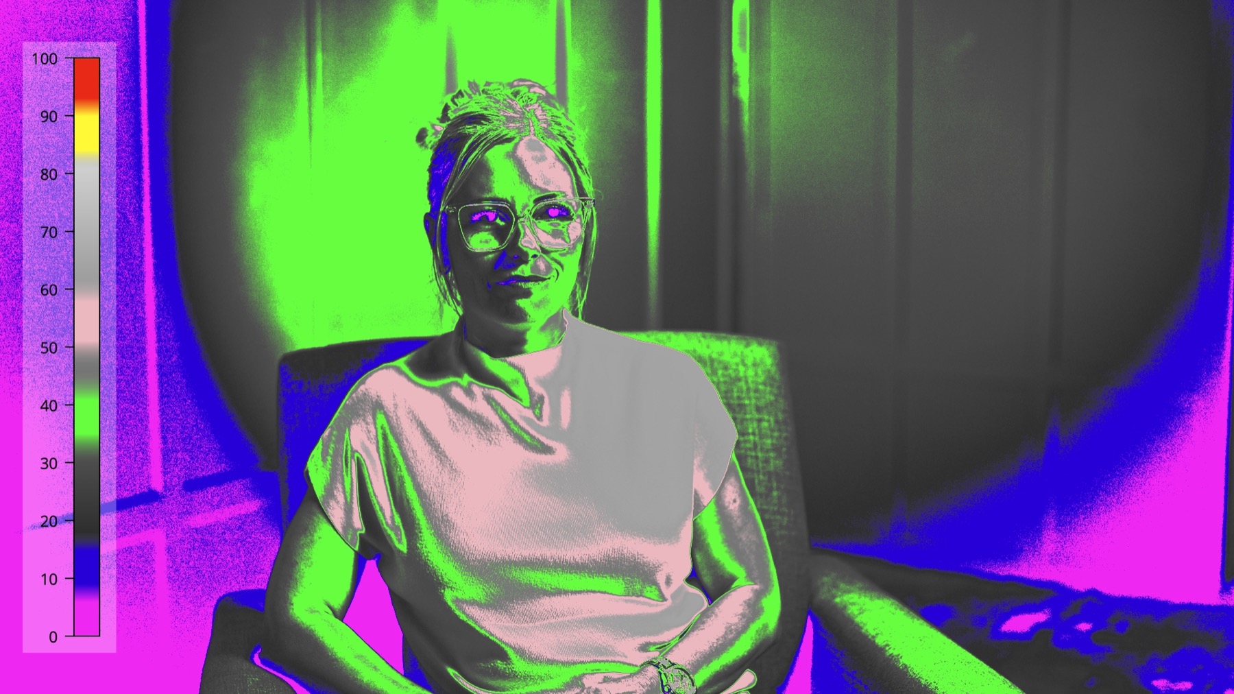
This is one reason I do not treat a meter and a monitor as competing tools. The meter helps me place the key and repeat the setup. The monitor and false color show how the entire frame is working together.
Solve the person in front of you, not the diagram
A lighting setup is never finished just because the first subject looks good.
One interviewee wore large glasses that sat farther away from her face. The key created strong shadows from the frames, and simply moving the key did not solve the problem. When the frame shadows improved, the eye sockets became too dark. When the eyes improved, the glasses produced distracting shadows again.
I added a very small Godox fixture with a lantern modifier—the same compact light I had tested in an earlier video—and positioned it high and close to the camera axis. Its job was not to become a new key. It only needed to lift the shadows on the forehead, around the eyes, and beneath the eyeglass frames.
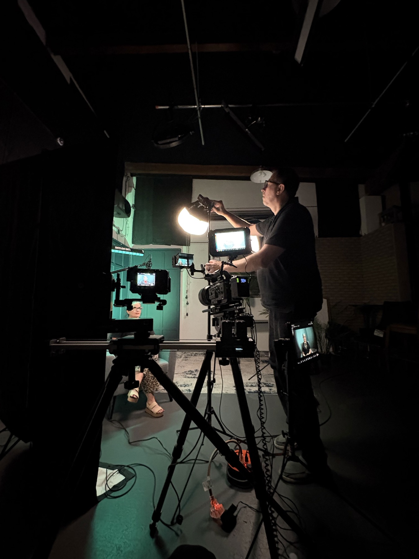
That adjustment reduced some of the contrast I had originally built, but it solved the more important problem. The subject’s eyes were visible, and the glasses no longer distracted from the interview.
This is the difference between lighting a set and lighting a person. The diagram is a plan. Every face, skin tone, hairstyle, wardrobe choice, and pair of glasses creates a new version of the problem.
A repeatable process for interpreting a creative brief
- Define the audience response. Decide whether the image should feel natural, formal, energetic, intimate, futuristic, or something else.
- Identify what must remain consistent. Protect the client’s brand, the event’s tone, and the exposure standards that connect every interview.
- Choose one meaningful departure. A strong new idea is usually more effective than changing every part of the setup.
- Build depth before adding decoration. Use shape, texture, gradients, and corners so the background does not become a flat color wash.
- Support the creative choice with technical control. Set the key, contrast, skin exposure, and background levels deliberately.
- Evaluate every subject again. Adjust fill, negative fill, reflections, and eyeglass shadows for the person in the chair.
- Keep the rule only while it helps the brief. If an unconventional choice creates the right feeling, test it instead of dismissing it.
Final thoughts
There are very few cinematography rules that should never be broken.
Rules and habits are valuable because they give us reliable starting points. But if we begin every setup with the same key, the same backlight, and the same relationship between color and contrast, the work can become disconnected from the story the client is actually trying to tell.
On this job, the creative brief gave me a reason to use RGB light more aggressively than I normally would in a corporate interview. The background color, hard overhead edge, controlled exposure, and practical fix for the subject’s glasses all came from responding to the specific frame in front of me.
Start with the feeling. Let that guide the composition, production design, color, and lighting. The equipment comes after the idea.
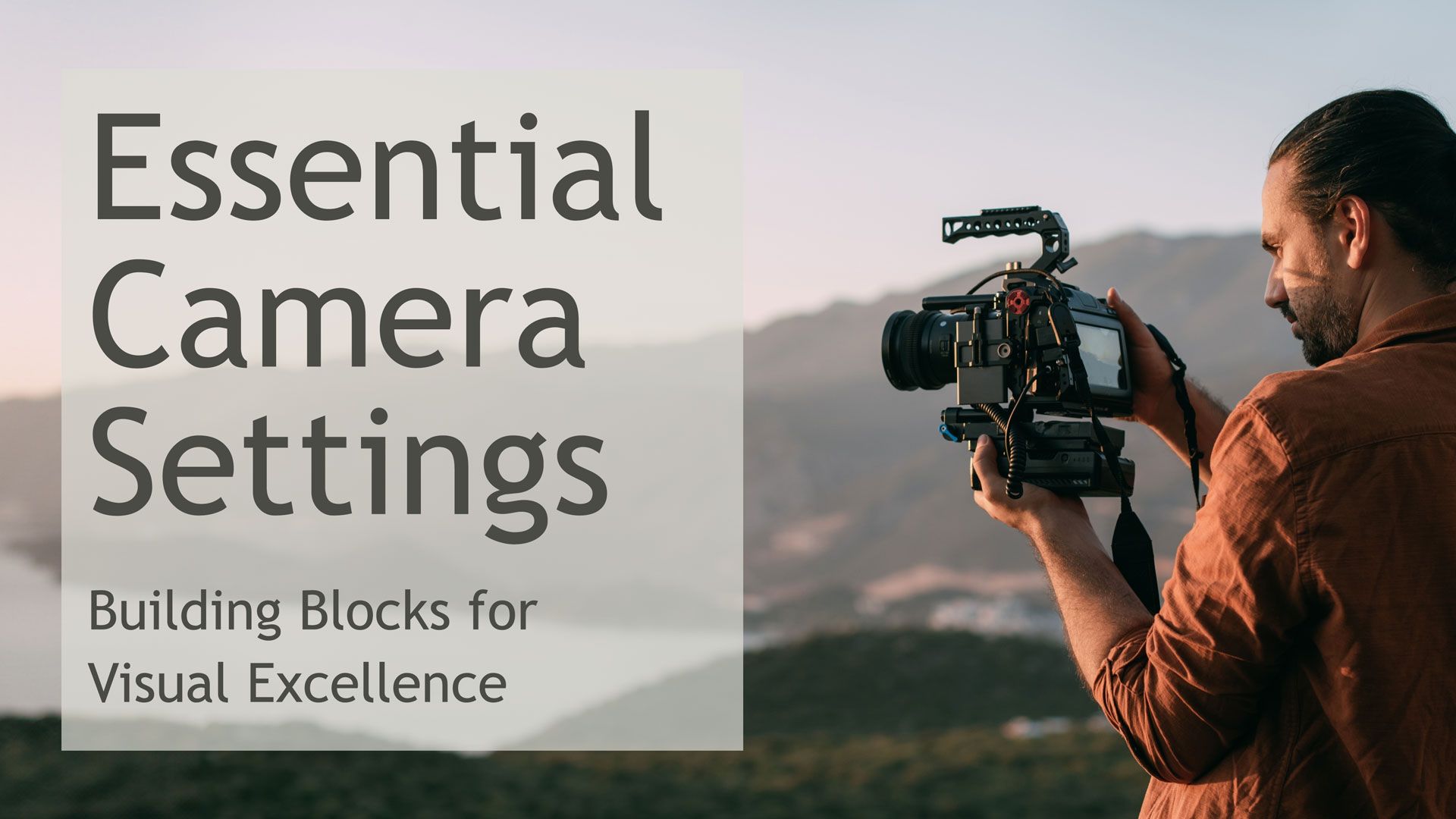
If you would like to learn more about exposure, camera control, lighting, composition, and creating more intentional images, be sure to check out my online course, Essential Camera Settings.
by Chris Tinard © cNOMADIC 2026
Learn more about cNOMADIC’s cinematography philosophy and training at cNOMADIC.com.