
Why LUTs Don’t Give You the Look You Expect
Mar 30, 2026Why LUTs Don’t Give You the Look You Expect
A LUT can enhance a look that already exists, but it cannot replace the exposure, contrast, and color decisions that create that look.
Have you ever downloaded a LUT designed to mimic one of your favorite films, applied it to your footage, and wondered why the result looked nothing like the example?
I have.
It is easy to assume that either the footage is wrong or the LUT is bad. But most of the time, neither one is the real problem.
The problem is the expectation that the LUT will create the look for us.
A LUT is built around a particular image—a particular combination of exposure, contrast, and color. If our footage was photographed with different lighting, different contrast ratios, different white balance, and different exposure priorities, the same LUT will produce a different result.
That does not mean LUTs are useless. They can work extremely well when they enhance an image that is already moving in the intended direction.
The look still has to begin on set.
Every image is built from three things
At its foundation, every image is a combination of:
- Exposure: where the important values are placed and which parts of the image are allowed to become bright or dark.
- Contrast: the relationship between highlights, midtones, and shadows.
- Color: the palette created by production design, wardrobe, locations, practical lights, lighting color, and white balance.
The moment any one of those changes, the result of the LUT changes.
A grade—or the LUT generated from that grade—is designed around a specific combination of those three elements. Applying it to a completely different image does not reproduce the original conditions. It only remaps the values that already exist in the new footage.

Testing a Wes Anderson-inspired LUT
To make this visible, I tested a LUT intended to create a Wes Anderson-inspired look.
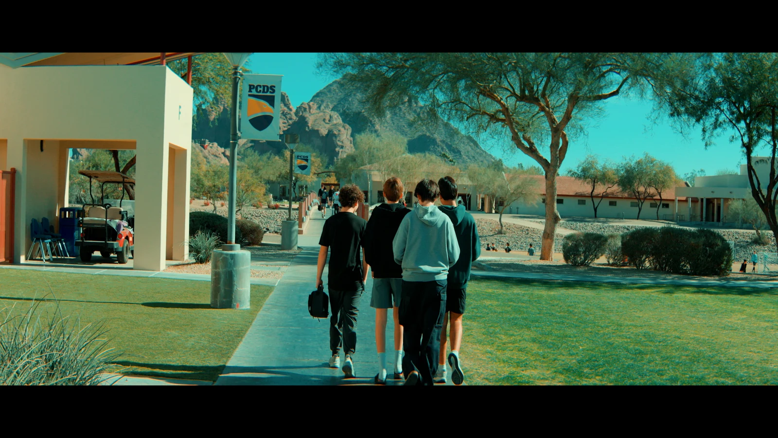
I chose a school exterior I had filmed in Phoenix because the mountain in the background had a rock color similar to the desert environment in Asteroid City. On paper, it seemed like a reasonable image for the experiment.
After applying the LUT, there was a suggestion of the expected palette. The building moved toward colors that felt compatible with the reference, and the image picked up the LUT’s strong cyan and green influence.
But it did not suddenly become an Asteroid City frame.
That was not a failure of the LUT. It revealed how different the two original images were.
The light on the day matters
The mountain in my shot was filmed under harsh midday sun.
That direct light reduced the subtle color relationships I hoped the LUT would reveal. It created a very different texture and contrast pattern from the softer, carefully controlled light in the reference.
A LUT can push the mountain toward another hue, but it cannot reconstruct the quality of light that originally shaped the surface. It cannot decide after the fact that the scene should have been photographed at a different time of day or under a different sky.
The building responded more successfully because its original color was already close to the target palette. The LUT did not invent that compatibility. The color was present in the location before the camera started recording.
This is one of the most useful lessons in the comparison: the parts of the frame that already belong to the intended visual world tend to respond more naturally.
Whites reveal what the LUT is doing
Neutral areas often make a creative LUT’s behavior easier to see.
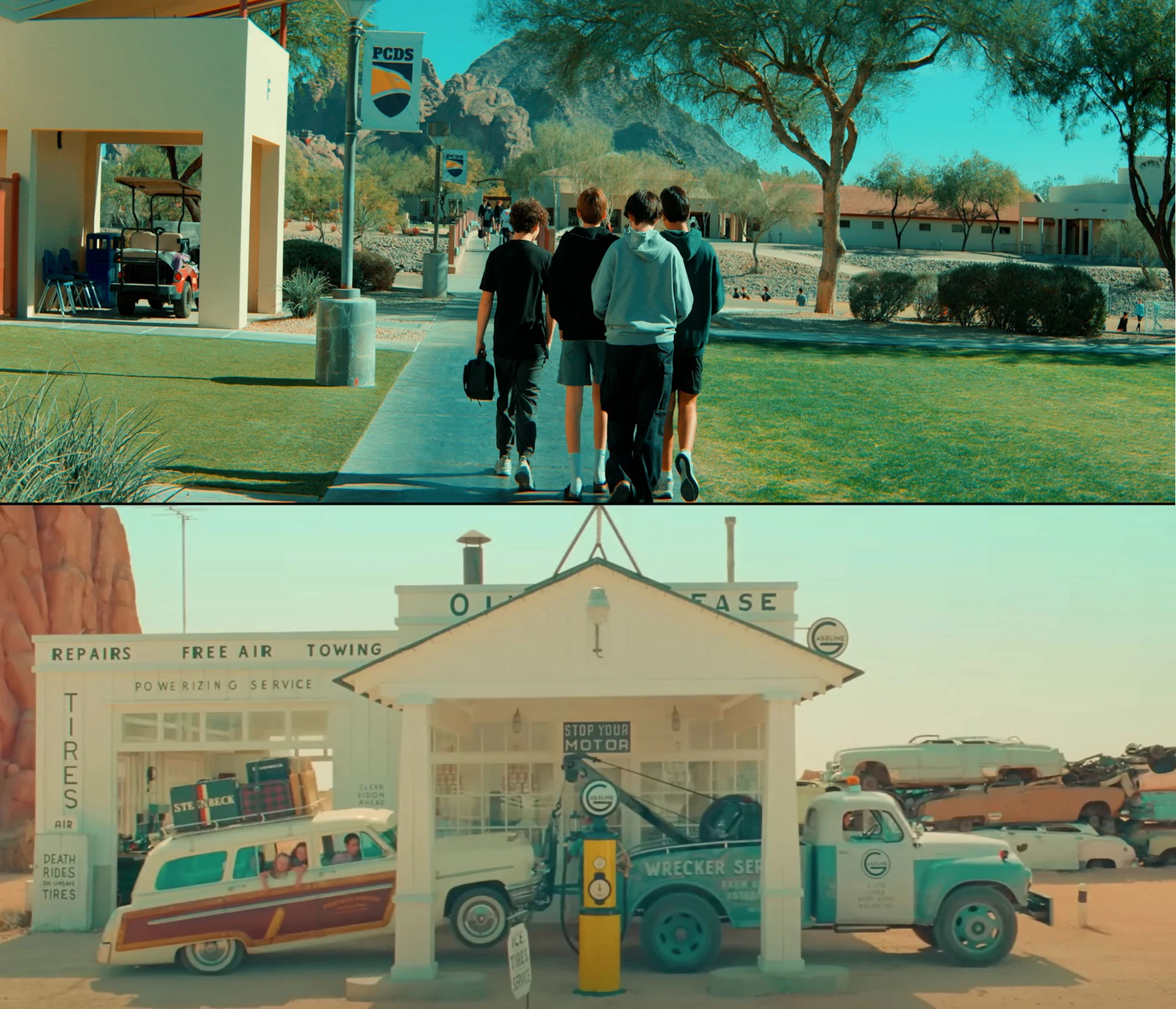
In the reference image, the light-colored truck and building retain a warm, creamy quality. They are not simply neutral white, but they still feel believable inside the palette.
In my footage, white banners shifted much more aggressively toward blue. The LUT was applying the same mathematical transformation, but it was working with different starting values.
This tells us that the reference image was not created by applying a LUT to an ordinary neutral scene. Color temperature, production design, lighting, exposure, and grading were all working together.
The LUT is only the final part of that chain.
Highlight placement changes the result
The sky provides another clear example.
When I photographed the school, I protected the highlights. There were no clouds, and I held detail across the bright blue sky. The result was an even area of blue that the LUT could push very strongly.
In the reference frame, portions of the sky and bright surfaces were allowed to approach or reach white. That created a much shorter tonal transition and a more delicate blue tint.
If I had known before the shoot that I wanted to move toward that specific result, I could have tested the LUT on a monitor and made a different exposure decision. I might have allowed the sky to become much brighter instead of protecting all of it.
That still would not guarantee a perfect match, but it would give the LUT values that respond more like the reference.
The important shift is that the exposure choice happens before or during photography—not after the shoot while scrolling through LUTs.
A LUT is not a correction tool
A creative LUT cannot fix an exposure decision that does not support the image you want.
It cannot rebuild a missing contrast ratio. It cannot make a flat lighting setup behave as though the key, fill, background, and practicals were designed for depth. It cannot make a cool production palette naturally become warm without consequences elsewhere in the frame.
A LUT can move values, but the relationships inside the original image still matter.
In the construction example below, the creative LUT changes the color response and overall character. But the relationship between the brightest and darkest areas remains rooted in the way the shot was exposed and lit.

Contrast is a relationship, not a preset
Contrast is the distance between the important tonal values in the image.
How bright is the subject compared with the background? How far does the key side of the face sit above the fill side? How deep are the shadows allowed to become? Are the highlights clean and bright, or soft and restrained?
Those relationships define the structure of the frame.
If I want a dramatic image but photograph everything with soft, even light and very little separation, a LUT cannot give me the same result as lighting for that contrast on set.
It may make the shadows darker or increase global contrast, but that is not the same as deliberately shaping the subject, background, and environment as separate visual elements.
Color begins before post-production
Modern grading tools can isolate and replace colors with extraordinary precision. But that does not remove the value of making intentional color decisions during production.
If I know the finished piece should feel warm, I can choose warmer practicals, wardrobe, surfaces, and lighting. I can set a white balance that supports that direction and make sure the sources inside the frame belong to the same visual idea.
If I photograph everything with cool daylight-balanced sources and then ask the grade to become deeply warm, every color and skin tone has to be pushed away from its original relationship.
The same is true in reverse. A room filled with warm practical lamps is not the most direct starting point for a clean, cool final image.
Consistency on set gives the grade something coherent to enhance.

A better workflow for using LUTs
Instead of beginning with the question, “Which LUT should I use?” I begin with, “What should this image feel like?”
From there, I can build a more intentional workflow:
- Define the visual direction before the shoot. Decide whether the image should feel warm or cool, bright or restrained, soft or contrasty.
- Study references for their underlying choices. Look beyond color. Examine exposure placement, highlight rolloff, shadow depth, wardrobe, production design, and lighting direction.
- Test the LUT before production. Load it into a monitor or grading system and learn what kinds of values it expects.
- Create compatible conditions on set. Choose locations, practicals, lighting, white balance, and contrast ratios that move toward the target.
- Expose for the intended result. Decide what to protect, what can clip, and where skin tones and important midtones should sit.
- Correct before applying the creative look. Normalize the image and solve basic exposure or white-balance problems before judging the LUT.
- Adjust the LUT rather than obeying it. Reduce its intensity or refine the grade when the transformation is too strong.
Final thoughts
A LUT is most effective when it is the final expression of choices that began before the camera rolled.
It should enhance the exposure, contrast, and color relationships already present in the footage. It should not be responsible for inventing the entire visual language of the project.
The more intentional those decisions are on set, the less time we spend in post-production searching for a look—and the more time we can spend refining one that already exists.
If you would like to learn more about exposure, camera control, lighting, composition, and creating more intentional images, be sure to check out my online course, Essential Camera Settings.
by Chris Tinard © cNOMADIC 2026
Learn more about cNOMADIC’s cinematography philosophy and training at cNOMADIC.com.